3.04.2011

"F" is for Friday...and a Fresh Look

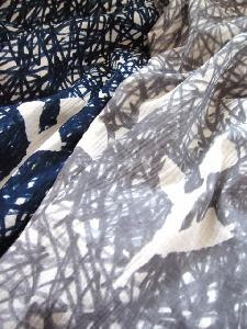
Mina Perhonen via mini/s blog
Mina Perhonen design via mini/s blog
Mina Perhonin is one of my favorite labels. Akira Minagawa is the owner and designer of this label. His work, especially his textile design is meaningful to me mostly because of the risks he takes...making him truly original, not "trendy". Design Sponge (from where I got some of my info here - thanks!) did a nice post on him here in '09. I do some textile designing, and have often found myself not attracted to what is "on trend" in the surface design world right now. So much of what is popular is what I think of as illustration. Lots of emphasis on representational themes and what the biz calls "conversationals". I admire illustrators very much and value what they do, but for textiles I want something more lyrical that allows people to blend them into their home with subtlety. I want my designs to feel like something natural and simple. When I first saw Mina Perhonen designs I was catapulted into a new space in my thinking. That's a very valuable experience to me. There is a blog, mini/s, you can look at too. Mostly in Japanese, but fun to look at. The Mina Perhonen website is here.

3.02.2011

Drawings

You can see where my head is. I have been making these little shoots and roots drawings/paintings for days now. Funny how I think of everything that isn't a big painting as a drawing. Even if it's in watercolor as these are. What defines a drawing anyway? It has some quality of possibility that is very specific to me. I like to work in sketchbooks so much because I don't get too tight that way, so I've been practicing on sheets of paper instead of in sketchbooks with these. Yesterday I made one on good arches watercolor paper and "choked" a little. Wonder what that is?

3.01.2011

Art Fill-Up

Motherwell, MFA Boston
Shrine, MFA Boston
Ancient ceramics + reflection at MFA Boston
MFA, Boston, the new wing!
Mark Bradford, Yale University Press
I got a much needed art fill-up this weekend in Boston. The first stop was to the ICA to see the Mark Bradford show. It is a large show of large works. I really respond to his work because of the surface quality. He uses caulking on some work to build up a surface, then sands it with an orbital sander, then works more layers of paper and paint over that. He works on canvas sometimes, but I am especially interested in the works that are created by a build-up of layers of found paper, signs, tape, wrapping paper, and who knows what else. The color is subtle and painterly. On Sunday we went to see the new wing at the MFA. Stunning. You can feel the resurgence of energy there because of this new wing. I like the opportunity to spend long periods of time visiting one or two pieces of art. I always go for the contemporary paintings first, but then end up staring at the ancient ceramics and shrines for the longest time. I think it goes back to being a child with a love of history. I remember just being fascinated by the words "spice route" when we studied that! Ever since then I've been drawn to ancient art. We also had large quantities of pan-fried dumplings, which we can't get in Maine.

Related Posts Plugin for WordPress, Blogger...